››
LinkedIn Carousel Size in 2026: Every Dimension, File Limit & PDF Spec
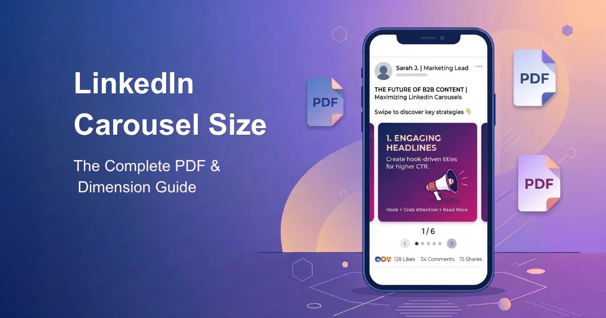
You've probably heard someone call it a "LinkedIn carousel." Open LinkedIn's own post composer, though, and there's no carousel button anywhere. What you're actually looking for is called a document post — and that naming gap is exactly why so many sizing guides online contradict each other.…
⚡ Key Takeaways
- A LinkedIn carousel is technically a document post — a single PDF (or DOC/DOCX/PPT/PPTX) uploaded as one file, not a sequence of separate images like Instagram's carousel format.
- LinkedIn's document upload limit is 100 MB and 300 pages, per LinkedIn's own file-size guidance, though 8–12 slides is the practical sweet spot for retention.
- Recommended slide dimensions are 1080 x 1080px (square, 1:1) or 1080 x 1350px (portrait, 4:5) — LinkedIn doesn't mandate a pixel size for documents, but these match how the file renders in the mobile feed.
- LinkedIn's separate multi-image post format is capped at 20 photos, confirmed directly on LinkedIn's Help Center — this is a different feature from a document carousel, and mixing the two up is one of the most common spec mistakes.
- A LinkedIn profile picture should be at least 400 x 400px, and a personal cover photo should be 1584 x 396px (4:1).
You've probably heard someone call it a "LinkedIn carousel." Open LinkedIn's own post composer, though, and there's no carousel button anywhere. What you're actually looking for is called a document post — and that naming gap is exactly why so many sizing guides online contradict each other. People are searching for "carousel," writing about "carousel," and building tools called "carousel makers," while LinkedIn itself has quietly called this feature something else since it launched.
This guide uses LinkedIn's real terminology, sourced from LinkedIn's own Help Center wherever LinkedIn publishes a number, so you're not left guessing which of five conflicting blog posts to trust.
What "LinkedIn Carousel" Actually Means in 2026
LinkedIn briefly tested a native carousel ad format years back, and that name stuck in people's vocabulary. What creators and brands post organically today — swipeable, multi-page content in the feed — is the document post: you upload one PDF (or a handful of other file types), and LinkedIn renders each page as a swipeable slide.
This distinction isn't just pedantic. It changes what "size" even means:
On Instagram, a carousel is a set of separate image files, each with its own pixel dimensions you control directly.
On LinkedIn, a carousel is one document. Every page inside that document needs to share the same page size, because LinkedIn renders the file as-is — it doesn't let you set individual dimensions per slide the way Instagram does per image.
That's why every LinkedIn carousel guide worth trusting talks about page dimensions inside your PDF, not an upload-time crop tool, because there isn't one.
LinkedIn Carousel (Document Post) Specs — 2026
Spec | Value |
|---|---|
Format | Document post (PDF, DOC, DOCX, PPT, or PPTX) |
Recommended format | PDF — most reliable for preserving layout, fonts, and slide order |
Max file size | 100 MB |
Max page count | 300 pages |
Practical page count | 8–12 slides |
Square dimensions | 1080 x 1080px (1:1) |
Portrait dimensions | 1080 x 1350px (4:5) |
Wide dimensions | 1920 x 1080px (16:9) — for tables, timelines, wide screenshots |
Color mode | RGB (not CMYK) |
Minimum text size | 24pt+ recommended, avoid anything under 11pt body text |
If you only remember one number from this whole guide: export at 1080 x 1350px, as a PDF, keep it under 10 MB, and stop around 10 slides.
Why Portrait (4:5) Usually Wins
Square carousels are the safer, more conservative default — they render consistently across every device and don't risk any cropping. But portrait carousels take up meaningfully more vertical space in a mobile feed, which is where the overwhelming majority of LinkedIn's traffic comes from. If your content is text-heavy or educational — the kind of carousel that actually benefits from someone spending more time looking at it — 1080 x 1350px is the stronger default.
Wide (16:9) carousels are the specialist option: reserve them for content that's genuinely wide, like a comparison table, a timeline, or a full-width screenshot. They read noticeably worse on mobile, since a wide slide fills less of the vertical screen someone's actually looking at.
Designing Slides That Don't Get Cropped
A correctly-sized document can still look broken if the content inside it ignores how LinkedIn's interface overlays the file:
Leave padding on every edge. Keep text and key visuals inside roughly the center 80% of each slide — LinkedIn's UI elements (page counters, download button) sit near the edges and can visually compete with content placed too close to the border.
Don't bury the message at the bottom. The bottom of the frame is where LinkedIn's navigation and interaction bar sits when someone's actively swiping — content placed there gets visually crowded out even if it's not technically cropped.
Design your first slide like a thumbnail. It's the only slide most people see before deciding whether to swipe. A large, clear headline with an arrow or visual cue toward the next slide consistently outperforms a slide that just states a topic.
Keep every page the same size. Mixed page dimensions inside one PDF force LinkedIn to render the file awkwardly — pick one canvas size in your design tool and stick to it for the whole document.
Use real body text, not tiny captions. Text under roughly 11pt becomes difficult to read on a phone screen, which is where most carousel views actually happen.
Document Post vs. Multi-Image Post — They're Not the Same Thing
This is where a lot of confusion comes from, and it's worth being precise about, since the two formats have completely different specs:
Document Post (Carousel) | Multi-Image Post | |
|---|---|---|
What it is | One PDF/DOC/PPT file, rendered page-by-page | Multiple separate image files in one post |
Max items | 300 pages (practically: 8–12) | 20 photos, confirmed on LinkedIn's Help Center |
File size | 100 MB total | 5 MB per image (commonly cited spec) |
Layout in feed | Swipeable slider with page counter | Grid or side-by-side layout depending on image count and shape |
Best for | Frameworks, tutorials, case studies, listicles | Event recaps, before/after shots, product shots, team photos |
If your content is a structured, step-by-step idea, the document post is almost always the better fit — it reads as more intentional and professional. If you're just sharing a handful of standalone photos with no real sequence to them, a multi-image post is simpler and doesn't require you to design a PDF at all.
Every Other LinkedIn Image Size You'll Actually Need
Asset | Recommended Size | Notes |
|---|---|---|
Personal profile picture | 400 x 400px minimum (up to 7680 x 4320px), max 8 MB | Displays as a circle; keep the subject centered |
Personal cover photo | 1584 x 396px (4:1) | Max 8 MB; keep key content in the center ~1260 x 300px safe zone |
Company Page logo | 400 x 400px (268 x 268px minimum) | Max 3 MB; test on both light and dark backgrounds |
Company Page cover | Upload 4200 x 700px, displays at ~1128 x 191px | Max 3 MB; keep important content away from the lower-right corner |
Single feed image | 1200 x 627px (link preview) or 1200 x 1200px (square) | Max 5 MB; JPG, PNG, or non-animated GIF |
Article cover image | 1920 x 1080px (16:9) | Appears both in-feed and as the article's banner |
Event header/banner | 1280 x 720px (16:9), 480px minimum width | Per LinkedIn's event creation guidance |
Video Specs — Where Sources Actually Disagree
Most of the numbers in this guide are consistent across LinkedIn's own documentation and every reliable third-party source. Native video length is the one exception worth flagging honestly rather than picking a number and hoping it's right: published figures for organic video length range from 10 to 15 minutes depending on the source and possibly the upload device (desktop vs. mobile), with a file size ceiling generally cited around 5 GB. Rather than repeat a number here that might be stale by the time you read this, confirm the current limit directly in LinkedIn's post composer before recording anything close to the ceiling — the upload interface will tell you the live limit at the moment you try to publish.
Common LinkedIn Carousel Mistakes
Uploading separate images instead of one PDF. This creates a static image grid, not a swipeable carousel — the two look completely different in the feed.
Mixing page sizes inside one document. Even a single mismatched page can distort how the whole file renders.
Putting your best content on slide one. The first slide's only job is to earn the swipe — save your strongest insight for slide two or three, once someone's already committed to reading further.
Confusing document posts with multi-image posts. They have different limits, different layouts, and different use cases — treating them as interchangeable leads to a mismatched design.
Text too small to read on a phone. Most carousel views happen on mobile; anything under roughly 11pt risks becoming genuinely unreadable at that screen size.
Building Carousels Without Doing the Pixel Math
Getting a LinkedIn document post right means designing to a specific page size, exporting cleanly as a PDF, and keeping every slide consistent — every time you want to post one. That's a lot of repeated manual work for something you're hopefully doing regularly.
Treplino includes a built-in LinkedIn carousel builder: create the slides, and it handles the correct dimensions and PDF export automatically, then publishes the finished carousel straight to your LinkedIn profile on schedule — no separate design tool, no manual export step, and no re-checking this guide's spec table before every post.
✨ Boost Your Reach
Schedule & Auto-Publish Social Media in Minutes
Join thousands of creators & brands using Treplino to generate high-performing posts and automate daily social growth.
Start Free TrialNo credit card required
A
Written By
Asad
Social Media Strategist & AI Specialist
Asad writes on social media automation, content marketing algorithms, and AI growth strategies for modern creators and marketing teams.
Frequently Asked Questions
Design at 1080 x 1080px (square) or 1080 x 1350px (portrait), export as a PDF, and keep the file under 100 MB — LinkedIn's stated document upload limit.
Keep Reading
Related Articles
Try Treplino Today
Supercharge Your Content Publishing & Social Strategy
AI writing tools, calendar planning, WordPress auto-sync, and automated scheduling across LinkedIn, Facebook, and Threads.
Start Your Free Trial